The project
Between 2016 and 2019 I worked at Booking.com, the biggest accommodation website in the world. I was involved with the Genius program, Booking.com's loyalty program. During these years, I worked together with UX Designers, Researchers, Copywriters, Engineers, and Product Managers. Our work directly impacted millions of travelers all around the world.
During this time, I'd got involved in more than 200 experiments and A/B Tests. I also helped to shape the Genius Program, directly collaborating in the main initiatives to boost the product around the world.
Context
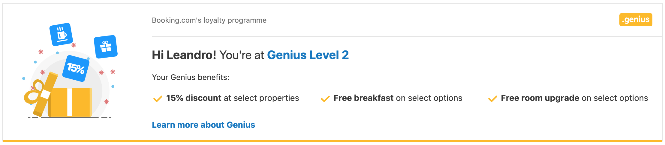
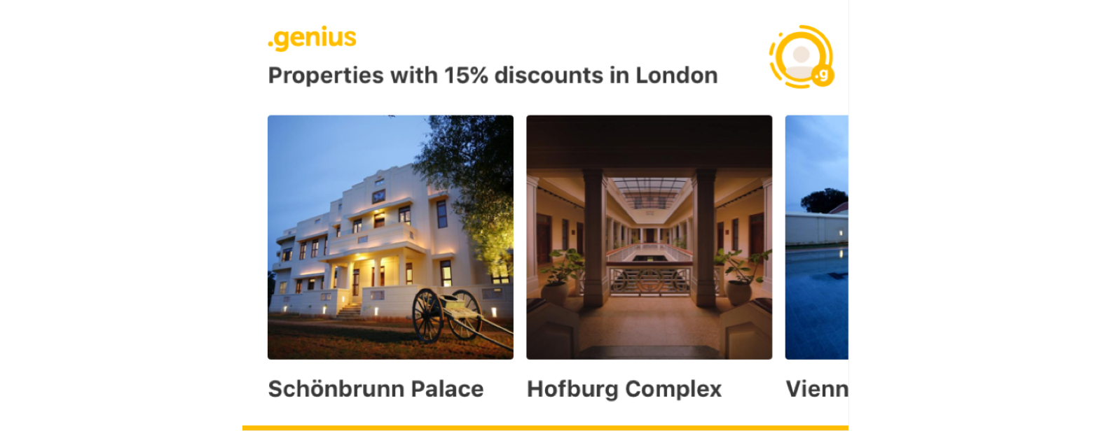
Genius is a loyalty program that rewards customers that travels a lot using Booking.com. People that are part of the program, the Genius Users, unlock access to exclusive discounts and benefits.
There were two main challenges while I was designing this project:
- How can I keep the customers that are part of the program informed about the benefits without creating an information overload?
- How can I use Genius to motivate new customers to join Booking.com?
The Genius Challenge
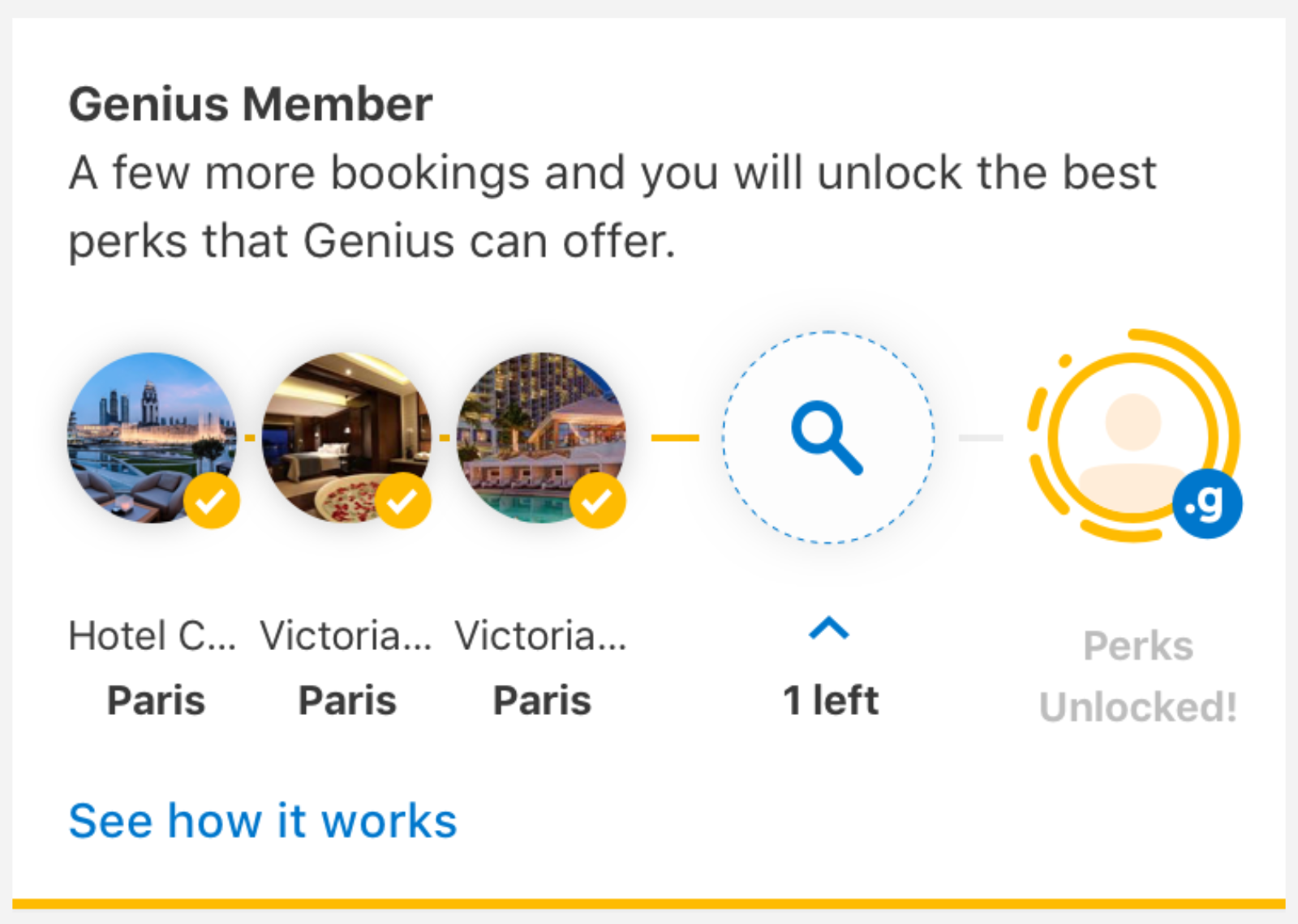
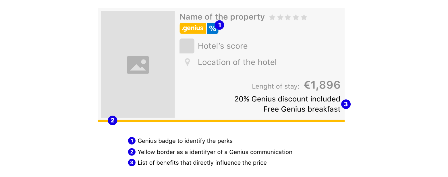
This widget was designed to help non-Genius users to understand what they have to do to unlock the program's benefits. The design had to be simple enough to fit in every place at Booking's website. So, other teams could decide to turn the widget on or off when they want to use an extra motivation for people to use the product. Also, it had to explain to the users in a visual way what they need to do to have access to the loyalty program's benefits, what they did, and how far away they are of the discounts.
It was validated through a series of qualitative research, like usability testings, focus groups, and expectancy tests. All of these tests were done to make sure that we were delivering the right message about the program for someone that has no context about what Genius is.
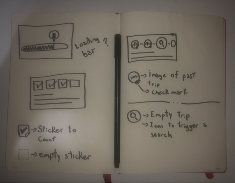
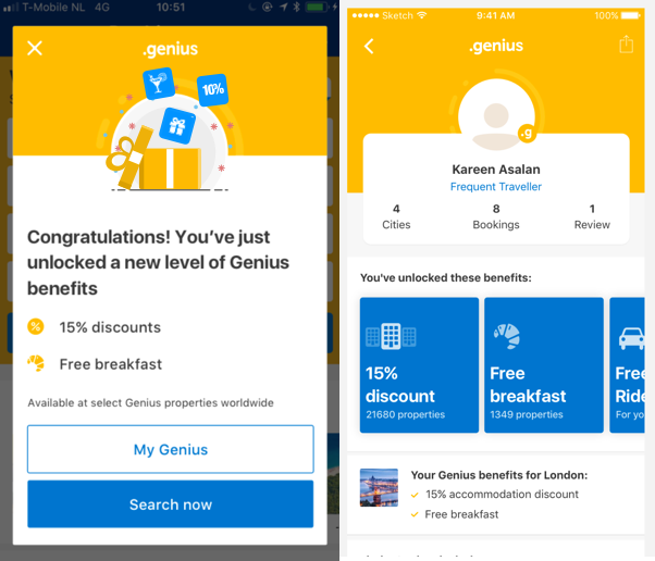
After making sure that the message was resonating with the users, it was time to figure out what was the better placement for the widget on the user journey. To figure this out, I did a lot of A/B Tests. It helped me to learn the impact of the widget in the product metrics in different placements at Booking.com's products. These learnings helped me to create a list of recommendations for other designers to use Genius communication.
User Journey Mapping
I worked together with the UX Research team to create a journey mapping for loyal customers. This helped us to identified key moments that Genius' communication could make a positive impact. The Genius message hierarchy and design should change on these key moments. So it will be presented in a way that fits better with the user's context and expectation.
Before the user book, we had to identify if the user is just browsing or if they are actively looking for someplace to stay. The message had to match these intentions. If the user is just browsing, the goal was to inspire them with destinations. If they are searching, the message should be more informative and guide them to find the perfect place to stay.
After the user finished the booking, there were the celebration moments, where the design had to celebrate the fact that the user had a good deal because they are a loyal customer. Also, there are moments where the user wants to learn more about the deal that they had booked, and the design needed to help them to learn more about it.
The Gift
What could be used as one icon that represents the feeling of unlocking benefits? After testing different icon variations, I ended up with one illustration of a gift. It represents the anticipation of a good surprise and, after opening it, the joy of receiving something good for free.
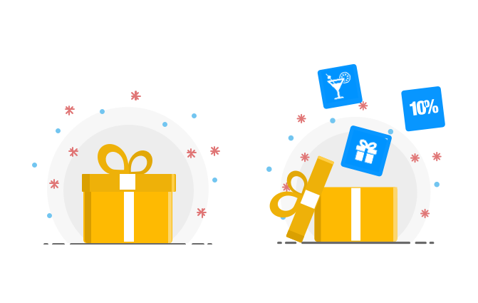
This image was an important part of the brand and a good representation of what we want to build as a program.
Final Thoughts
During the 3 years that I worked at Booking, the Genius program more than doubled the number of users.
The design was created balancing the business and the user goals in mind. Genius exists as part of Booking.com, and I never had the intention of making one design that stands out more than the Booking's look and feels. Loyal customers trust in Booking's brand. My goal was to make the program fit inside Booking's ecosystem, and build something that increases the trustiness and fill the needs of loyal customers.